How Duolingo Bypasses the Habituation Filter
A study into Duolingo's user experience and the measures they took to bypass our tendency to reduce our investment into repeated, predictable events around us.

Background
Duolingo is a well-known product in the edtech space. It helps users learn new languages and provides certifications for the same. It currently offers 43 courses across widely-spoken languages such as Spanish and French (~68M users at the time of writing this), fictional languages like Klingon, and even Chess and Music on their mobile app across iOS and Android.
Here's a link to their Company Handbook. It goes over their engineering principles, such as "Don't do dumb s**t". Super inspirational.
Clearly, they’re doing very well to keep users engaged in an era of alarmingly low levels of attention span. This success can be broken down into clever gamification, hyper-personalisation, and well-researched user psychology analysis.
Their educational model is based on breaking down lessons into bite-sized units that users are encouraged to undertake each day. This is done using ‘streaks’ - a common gamification method that quantifies consistency (to an extent). Each day a user completes at least one lesson, their streak goes up by one. This is a fairly common mechanism in habit-tracking apps across education (Khan Academy), fitness (Strava), and mental wellness (Headspace). Combined with creative visuals and rewards, Duolingo has made streaks a key pillar of their user retention and DAU metrics.
I personally dislike streaks as a concept for social media applications. While they work well for value-adding activities such as exercise and learning, I think other products can use them as ill-intentioned sources of pressure rather than actual user well-being.
Interestingly, this ‘short and sweet’ mechanism isn’t followed in their onboarding process. Traditionally, these highlight a product’s value to a user in a quick, digestible way. Poor onboarding processes could trigger abandonment rates of 40-60% after initial signups.
Common strategies to prevent this are:
- Focus on value transfer. Show (don't just tell) what solution is provided to the user. The app walks through a sample lesson, giving users a clear picture of what they can expect from the app and how it will help them accomplish their goals of learning a new language.
- Show only the most important features. Limit yourself to the core and let users experience the app as soon as possible. At a later time, when users are engaged, you can give more information or in-app onboarding. Duolingo, however, takes a different approach here. They focus on the user and set up a learning plan very quickly into the onboarding process. Because of this, they can translate that initial burst of interest into a commitment.
- Short & clear. The faster is better. For longer flows focus on positive engagement. Use progressive disclosure to show where users are in the process. Duolingo attempts to personalise each user's journey very early on - when it comes to setting learning goals, current skill levels, or learning commitments.
What issues they could face
A key problem for a product like Duolingo is keeping users engaged over significant periods of time. Steven Bartlett discussed the habituation filter in his book ‘Diary Of A CEO’, specifically from a perspective of scaling his media company and keeping subscribers invested. Human beings tend to reduce responses to repeated, irrelevant stimuli, acting as an attentional filter to conserve cognitive resources.
A very basic example of this is tuning out noise in a flight or train. While this is initially disruptive, our brains tend to ignore the noise which is how we can fall asleep despite the constant noise. Similarly, using an app every day with predictable journeys and content might reduce our investment and thus, our ability to learn from it. As a Duolingo user myself (going strong at 424 days of Japanese lessons), I was surprised at my ability to realise it was close to midnight and I should get my daily module done to avoid losing my streak (irrespective of where I am or whom I’m with). This was a key motivation behind this article, given my interest in user experience and product design.
How their designers prevented this
The simple answer to keep getting through to people would be to continuously introduce new stimuli through their journey. However, this can be very complex in terms of scale and experimentation. How do they know what kind of people would respond better to changing visuals or methods of streak reminders? Is it even possible to build a consistent interface that people can easily recognise and associate with? What if some stimuli negatively influence users into giving up on their pathways?
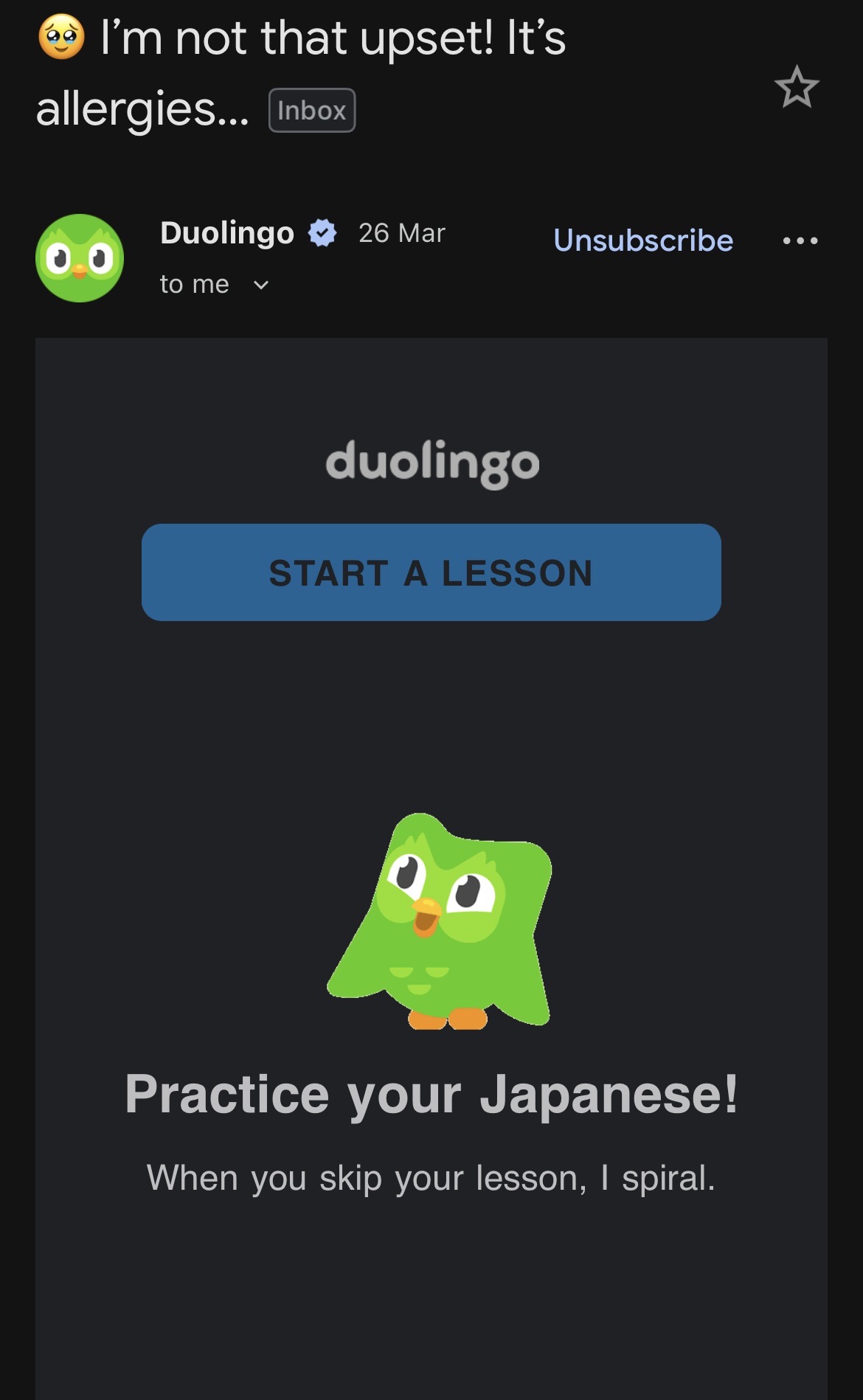
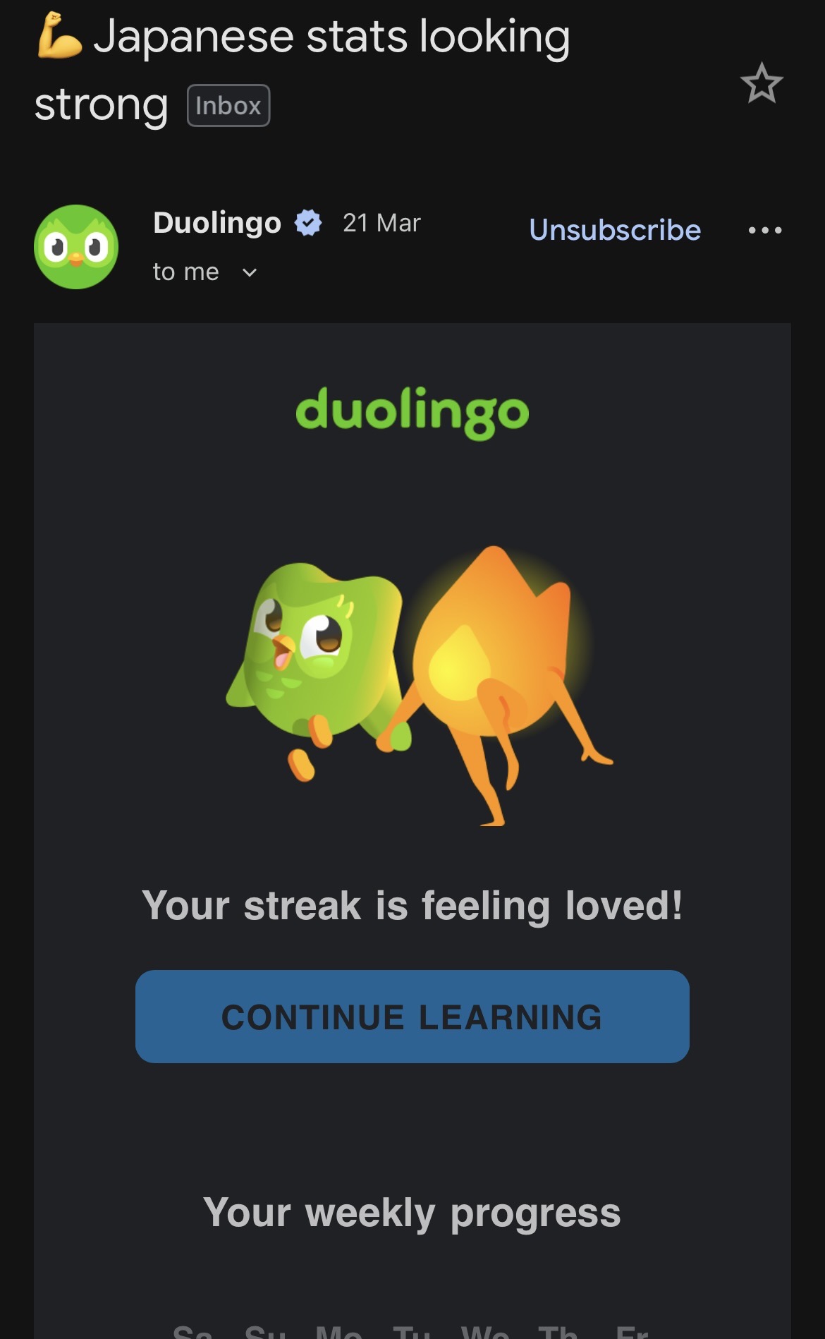
Email Notifications
Their notification system is interesting across two metrics: (1) email timing and (2) template format. Personally, I use the app between 8:00pm and midnight; most of my email reminders start rolling in around 6:30pm, which is probably not a coincidence. The email templates are designed to be read purely through notification widgets, given the unique subject line, enlarged avatar of the app's mascot, and otherwise minimalistic email content which only includes a link to the app.

App Icon Covers
The home screen is effectively the starting point for every user journey. It’s the first touchpoint in a session, and arguably the most repeated visual interaction a user has with any mobile product. Over time, this space becomes highly susceptible to the habituation filter — icons blur into the background, muscle memory takes over, and conscious attention drops to near zero.
Duolingo counters this by introducing small, playful mutations such as Duo melting, sleeping, reacting, or dressed for seasonal events. The key here is balance - the icon remains familiar enough to be instantly recognisable, yet different enough to interrupt autopilot behaviour. I found a Reddit post listing a few of these.