During my final year of university, I was accepted to a research fellowship at the Human Computer Interaction (HCI) Lab at King's College London. This involved improving the understanding around assistive communication devices and how decision-making could be improved within the space.
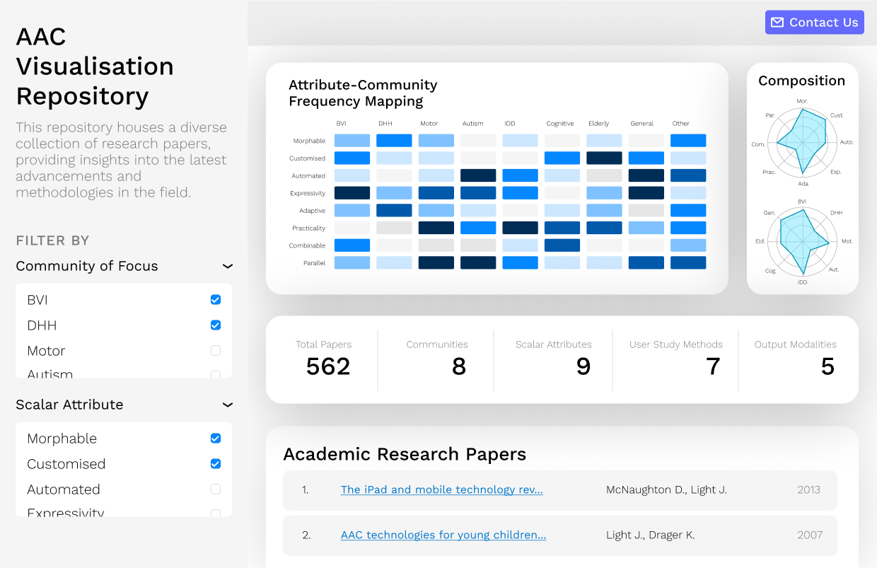
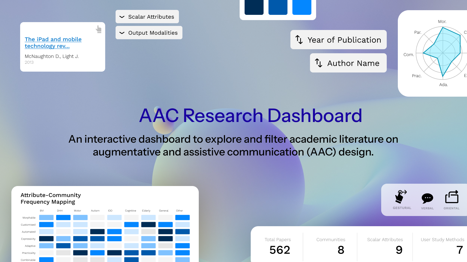
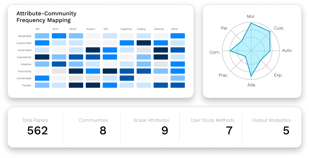
The data being used for the project was a repository of 562 articles across the ACM DL and SCOPUS academic databases surrounding AAC devices and their data. I was given the creative freedom to extract as much information as possible.
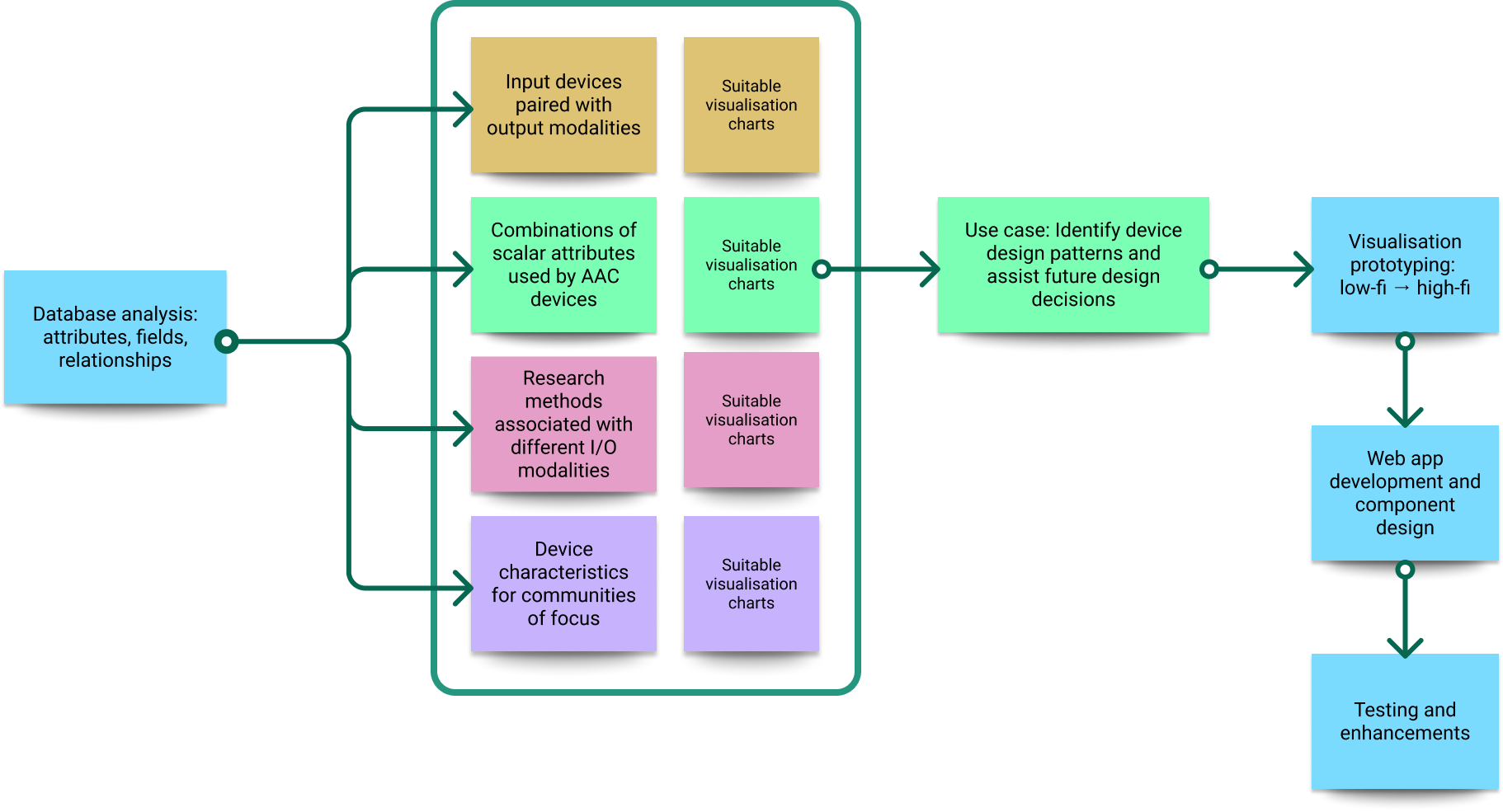
The dashboard is analytical in nature, which implies that its main purpose is dataset exploration and decision-making assistance. Based on this, visualisations were created keeping the following specifications in mind:
JavaScript was my chosen language for the dashboard, because of its extensive web support and data visualisation capabilities. Specifically, I employed a React architecture for the web app and routing. Charts were rendered using D3.js - a powerful JavaScript library built for flexible and interactive data visualisation. In essence, it creates Scalable Vector Graphics (SVGs) styled using CSS and placed directly in the Document Object Model (DOM).